Design Category: Industry Event Date: August 2nd-3rd 2017 Location: Sydney International Convention Centre, Darling Harbour, Sydney Australia Attendees: Myself and fellow Design Superstar Dixie Edwards
A Journey of Applied Learning
It demonstrates ‘Experience Marketing’ which is modern day story telling – time lined, visual and engaging. Among the vibrant imagery of Sydney and playful tourist pics and videos are design notes which I quickly jotted down for my own personal reference. If you start from the very beginning at ‘Day 1’ you will see that I have applied my newly acquired design knowledge from the conference. I learnt about 3D modelling, image compositing (layering) and ‘Experience Marketing’ to create my most recent works…
3D Modelling, Image Compositing, Art Reproductions and Fine Art:
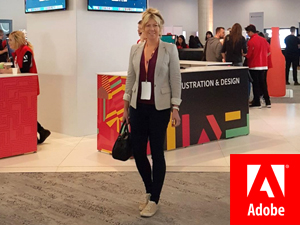
Program: Photoshop – “A Journey of Applied Learning by KJ Creative” – Just a simple image describing my project using the Adobe logo and their red pantone swatch. Please note: I don’t work for Adobe, I just use their programs on the daily and love their entire brand.
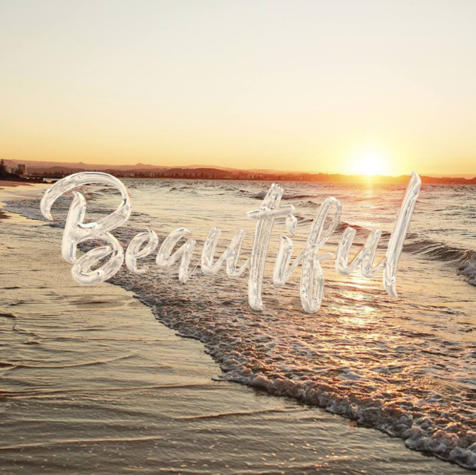
Program: Photoshop – I made text into a 3D object and applied chrome effect. The lighting is based on the background image; light, shadow and reflections. Photoshop Trainer Jesus Ramirez made some nice comments about this piece. I consider that a design win!
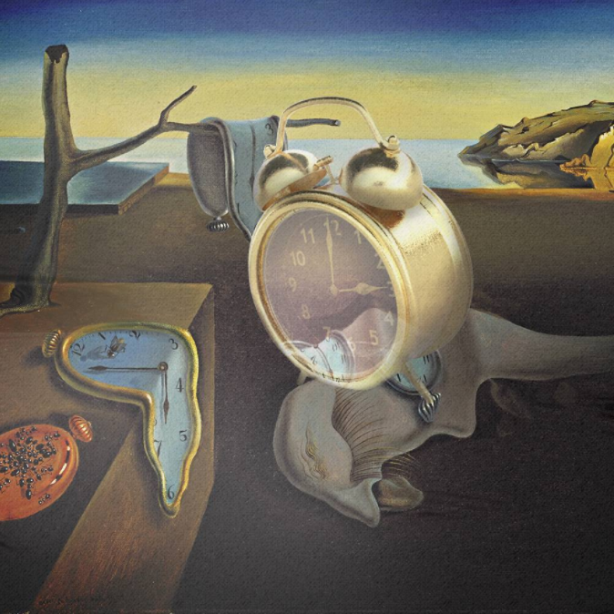
Program: Project Felix and Photoshop – “The Persistence of Memory by Salvador Dali” – I added the transparent gold clock using 3D modelling. I applied highlights and shadows plus painterly texture for an authentic feel, like the original.
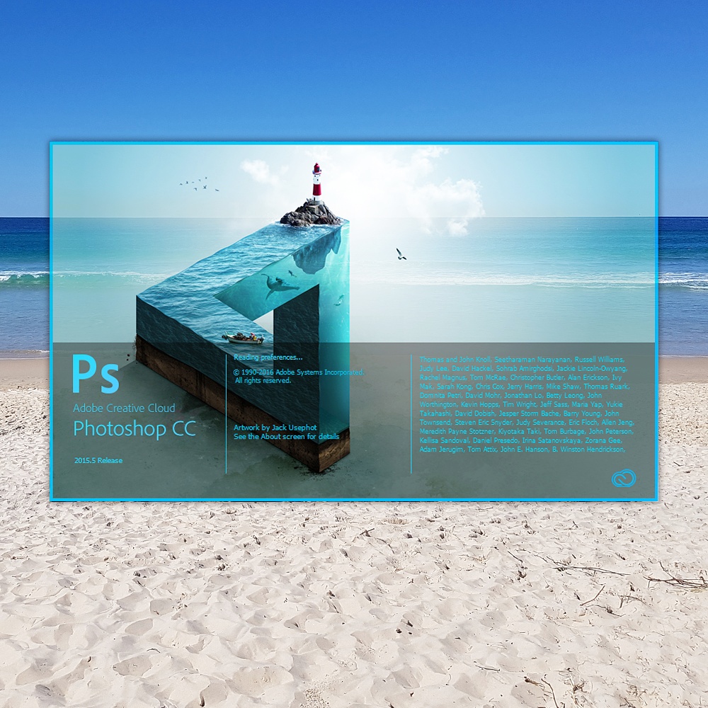
Program: Photoshop – I overlaid the PSD CC startup screen on top of a photo of the beach. This is nautical themed – sand, ocean, lighthouse etc. I like to use optical illusions. Are you looking at the ocean or a computer screen showing the ocean?
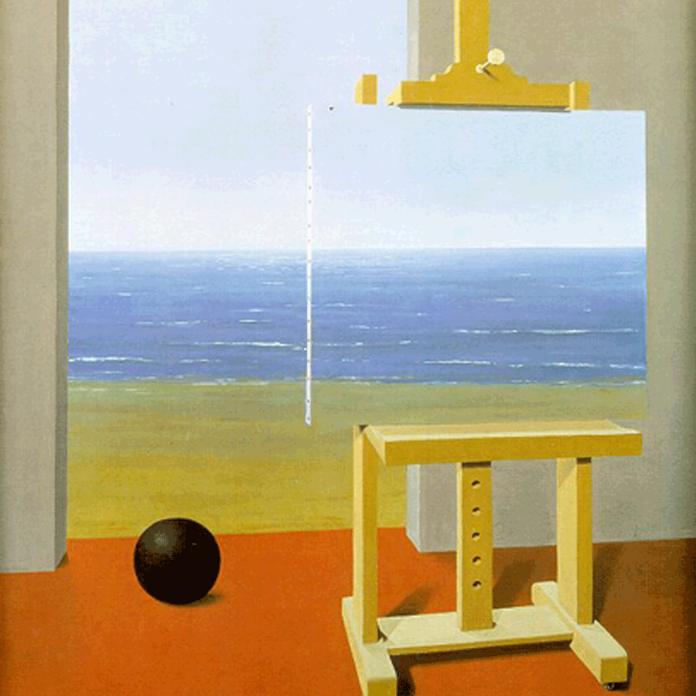
Painting: “The Human Condition” by Belgian artist Rene Magritte, 1935. Magritte was a surrealist painter. He too used optical illusions in his artwork. Are you looking at the ocean or a painting of the ocean?… It’s a little confusing but beautiful.
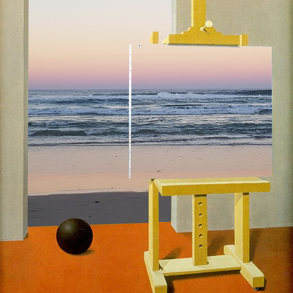
Program: Photoshop – This is a double optical illusion. I took a photo of Surfers Paradise beach at sunset then superimposed it onto Magritte’s painting. Are you looking at Magritte’s painting of the ocean or my photo of the ocean? Woah… Yeah.
Program: Illustrator – I redesigned the Adobe logo to be in the shape of the peace sign. I’m a big advocate for world peace, who isn’t? and Adobe gives people the tools to express themselves, build businesses and change the world starting from a single blank canvas.
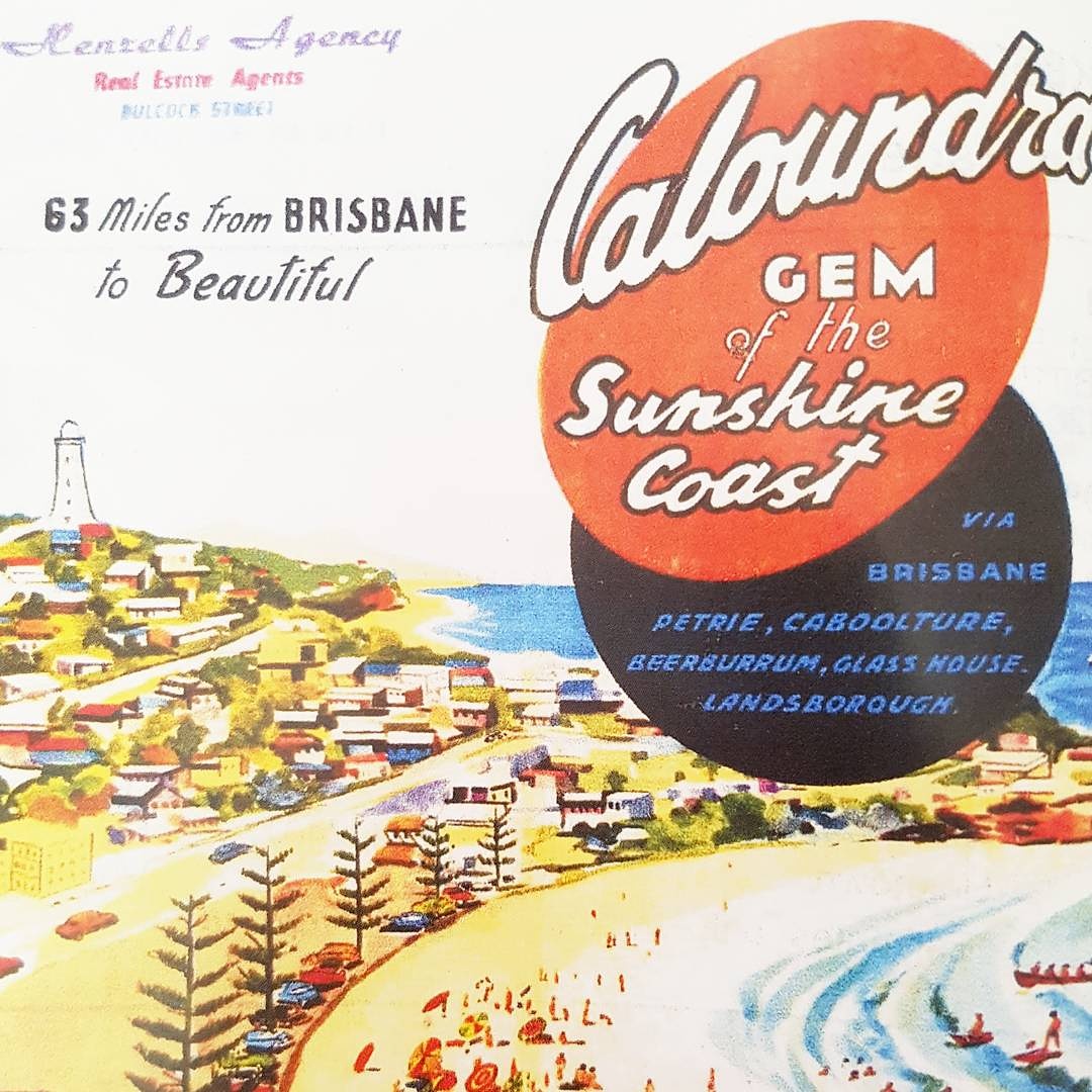
Print Ad: Last year I was staying at Caloundra; a quiet beach town in Queensland, Australia. I was sitting in a cafe at Kings Beach and came across a brochure featuring this 1960’s tourism ad. I took a photo of it. I have always drawn inspiration from this era of design.
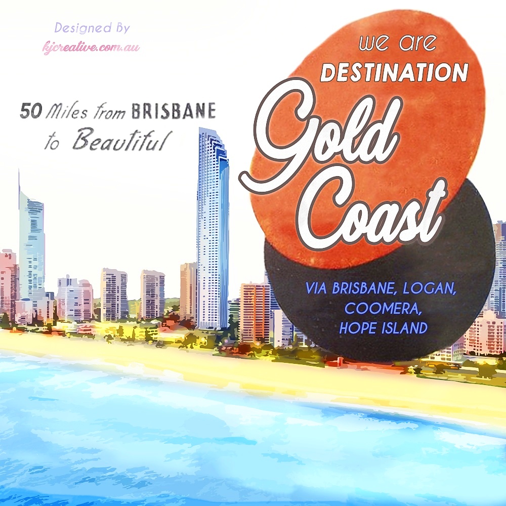
Program: Photoshop – I replicated the style of the Caloundra print ad and made one for the Gold Coast, my home town. I copied the layout, font style, colour scheme and simplistic illustrative style. I think it is important to look back at design work from the past.
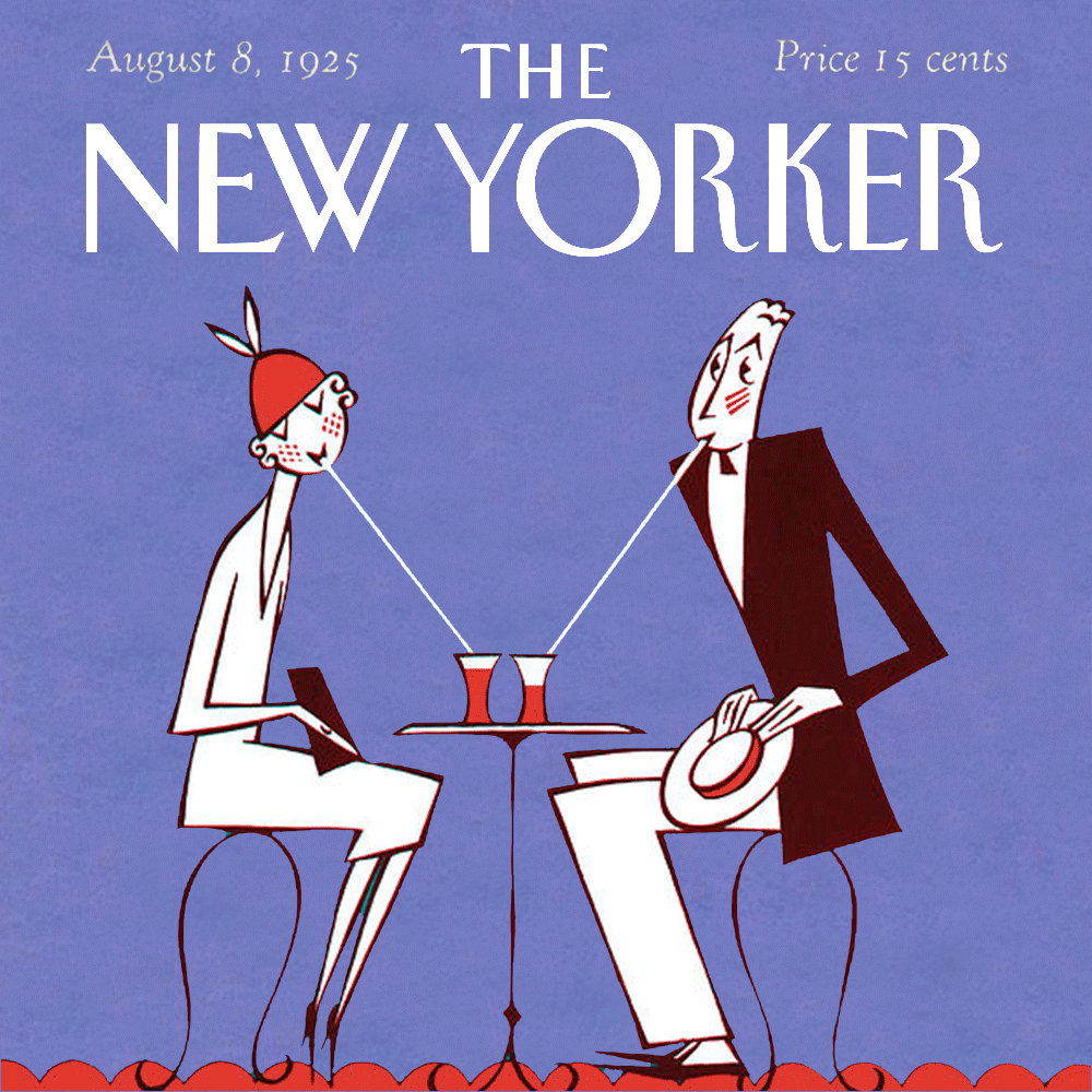
Program: Photoshop – I love NYC and The New Yorker Magazine. Most days I jump online to read the daily cartoon. So funny! This is a magazine cover from 1925. I changed the background to a lilac purple colour and added a beating heart between the couple.
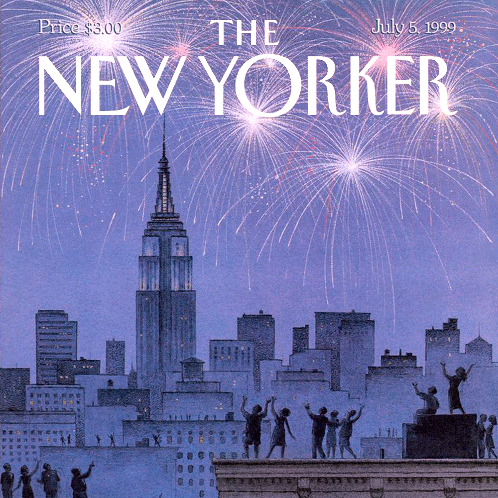
Program: Photoshop – This is a magazine cover from 1999. It shows the iconic Manhattan skyline. I added the fireworks and illuminated the title. As you can see, The New Yorker have kept the same hand drawn illustrative style since 1925.
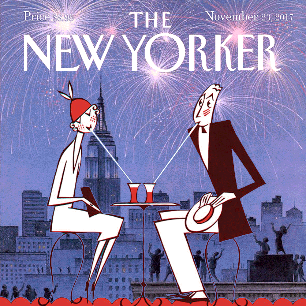
Program: Photoshop – I combined the covers. This shows how they both work seamlessly together. Such continuity, so timeless. And did you know that The Empire State Building (illuminated in the background) opened in 1931; a stunning era of art deco architecture and design.
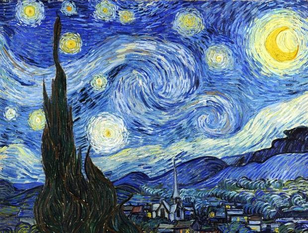
Painting: “Starry Night” by Dutch artist Vincent Van Gogh, 1889. Van Gogh is one of my favourite artists and I thoroughly enjoyed the film “Loving Vincent”. The blue swirls of paint and the glowing stars above the village are beautiful. The composition is perfection; he has applied the rule of thirds and painted the golden ratio mathematical equation repeatedly.
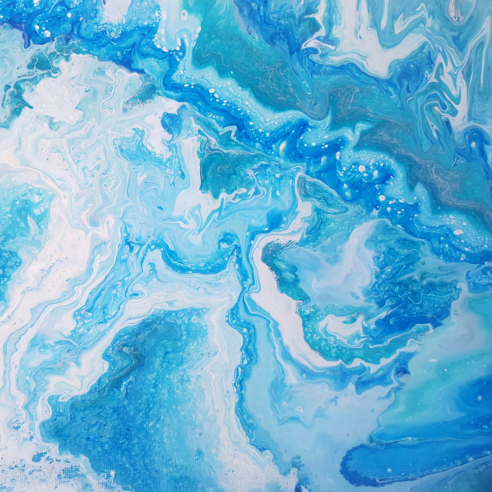
Painting: “Blue Waves” – this is my first liquid acrylic painting. It shows swirls of blue and white which represent the ocean and the movement of waves. I enjoyed painting this. There is a real knack to measuring and pouring the paints. It’s fast and free flowing.